

Well I'll be damned! HC.gov took my advice!
Fri, 11/20/2015 - 1:20pm
Late last night I posted a quick walk-thru of the all-new 2016 HealthCare.Gov Window Shopping tool. For the most part, it's a major improvement over the 2015 version (which itself was, of course, a massive improvement over the buggy, 78-screen original version launched for 2014 open enrollment).
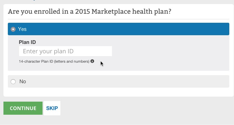
However, there are a few improvements which can always be made, and for me, one of the biggest ones is right at the beginning. Immediately after entering your Zip Code, the very first question which pops up is "Are you enrolled in a 2015 Marketplace health plan?"
Aside from the fact that some people may not even know whether or not their current plan is "through" the ACA healthcare exchange or not ("Marketplace" is a pretty generic term, after all...) the problem is that if you choose "Yes", here's what pops up:
It asks you to enter your current 14-character Plan ID.
There's a couple of problems with this. The little "info" pop-up icon explains where to find your Plan ID...but the screen doesn't explain why they're asking for it, nor does it explain that this is an optional field (clicking "Skip" will take you to the next screen, but you have no way of knowing this beforehand).
The larger problem is that a lot of current enrollees aren't going to have any idea what their 14-character code is and are gonna get frustrated trying to hunt down the letter (assuming they didn't throw it out by accident), or won't remember their login/password info. Obviously they'll need their login info to actually renew/switch plans actively, but right now they're just trying to shop around.
It turns out that the only reason to enter your current Plan ID is so that, once you've gotten to the actual plans, your current one will already be automatically entered in the "Compare Plans" box.
I came up with a pretty obvious solution:
Both the "Why do I need my code" and "Do I have to enter my code?" problems can be solved by simply adding the following to the first screen:
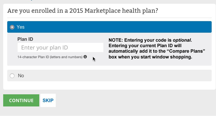
Well, guess what pops up on the 2nd screen of HealthCare.Gov today?
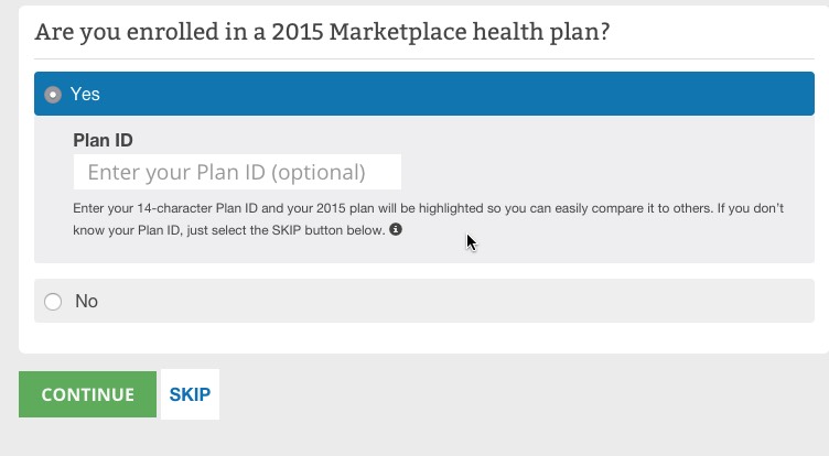
Hah!
Seriously, this is such a seemingly tiny thing, but any human interface designer ("User Experience" specialist, or "UX") can tell you that little improvements like this can have a significant impact on results. There's around 9 million people currently enrolled in ACA exchange policies, and around 6.7 million of them are likely enrolled via HealthCare.Gov specifically.
Let's assume that half of these folks actively renew/re-enroll for 2016 (the other half take no action and let themselves be automatically re-enrolled). Let's further assume that only 1% of them get confused/discouraged by the "Enter your 14-digit code" screen. That's still around 34,000 people nationally who may potentially have decided not to bother re-enrolling if they were stumped by the original version of the screen. In practice, some of them probably would have contacted HC.gov directly by phone, email, Facebook/Twitter or whatever to ask about it...but adding this simple message could also cut down on several hours worth of customer service center support, saving HHS a few bucks.
Kudos to HC.gov for continuing to improve the user experience.
Advertisement